1. What Is the Tool Used for
We’ve created the Google Ads Reports tool to simplify the reporting process for marketers, PPC specialists, and digital agencies. The tool transforms manual reporting into a fully automated workflow process. It helps you save working hours on reporting for clients and get valuable insights to boost PPC performance.
The PPC Reporting tool includes two types of reports:
- Scheduled PDF reports
- PPC report for Google Data Studio
To learn about scheduled PDF reports, read the guide.
From this manual, you will learn how to deal with the Promonavi GDS report.
The Data Studio Report consists of 16 pages with detailed performance data, from the dashboard with key metrics to sales funnel, data segments, and competitor analysis.
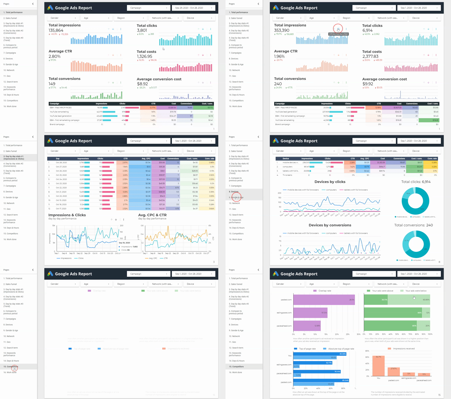
The PromoNavi’s GDS report is the most comprehensive in the market. Be sure that all PPC data you need is aggregated in one place. It is structured, visualized, and interactive.
2. Short-List of Key Features
- The fully automated reporting. All you have to do is to link your Google Ads account to PromoNavi and enable GDS reporting.
- Flexibility and interactivity. In contrast to the PDF report, the GDS report is not static. You can choose the campaigns, change the date, filter out the data by gender, age, and other criteria—available online 24/7.
- Report customization. You get full access to the report template, and you can edit it as you need.
- White-labeling opportunities. You can download your logo to use it in the reports for your clients. Otherwise, the report contains the default GDS logo.
- One-click sharing. You can easily share the report with your colleagues and customers.
3. How to Create a New Report
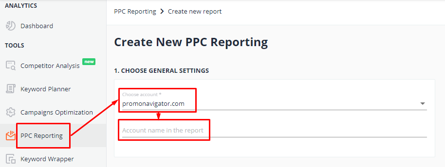
Sign up in PromoNavi and go to Google Ads Reports.
Choose the account for which you want to create the report, and name the report.
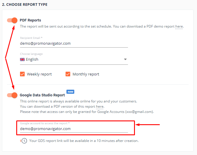
By default, both scheduled PDF Reports and GDS Report are enabled. If you need only GDS Report, you should disable PDF Reports.
To create a GDS Report, you should enter a Gmail address for which the report will be shared and press the “Create Report” button.
Within 5 minutes, the report will be ready. You’ll receive a link to your email. Also, the permanent link will be available in your PromoNavi account.

The created report contains data only for the account you’ve chosen. If you want to get the report for another account, you should create one more GDS report. The new report links will be listed in the table as well.
4. The Working Area of the Report and Filtering Options
The report includes 16 pages—they are listed to the left. On the page header, you can choose the campaign and date range.
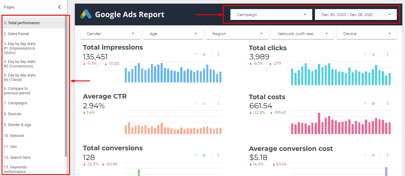
By default, the report shows data for all active campaigns from the connected account.
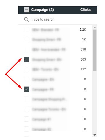
To show data for specific campaigns, click “Campaign” and from a drop-down choose the campaign or campaigns for which you want to see the stats.
On each report page, you can filter out the data by five criteria:
- Gender
- Age
- Region
- Network
- Device

You can apply one or several filters.
5. What Data is Available in the Report
#1: Total performance
The start page represents total performance data for selected campaigns. This page is an overview dashboard with key PPC metrics: Impressions, Clicks, CTR, Costs, Conversions, and Average conversion cost.
You can find here six charts and the table with mentioned metrics for each selected campaign.
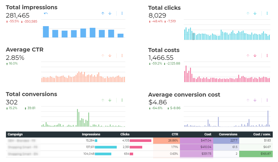
For your convenience, the higher values in the table are marked in more intense colors.
By default, the charts show the data change by the day. To drill down from days to weeks, click the down arrow above the chart. The next click on this arrow will result in drilling down from weeks to months.
To return to the previous state, click the up arrow. By clicking the reset icon, you will return to the default chart view.

#2: Sales funnel
Users move through several stages before executing the target action. Sales funnel visualizes their journey, from impressions to conversions.
Each stage of the sales funnel is characterized by its metrics. At the top of the funnel, it is important to understand the advertising capacity. That is why you can see here both potential and actual impressions.
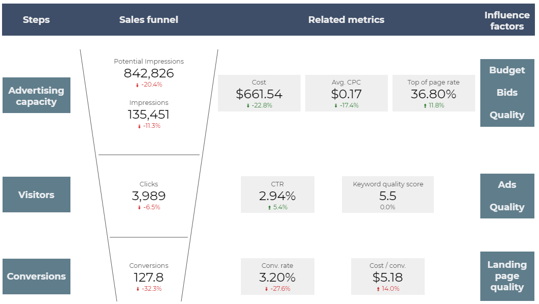
Impressions show your actual audience reach level. To achieve the Potential impressions level, your Top of page rate (which primarily depends on bids and ad spend) should be 100%.
Users move to the middle of the funnel after they click your ads. By increasing Quality Score, you can increase CTR and drive more clicks. That is why you see here all necessary metrics, such as CTR, Quality Score, and Clicks.
Users who executed the target action reach the bottom of the funnel. You can find here Conversions, Conversion rate, and Conversion Cost. By improving your landing page, you can increase the Conversion rate and get more leads.
#3: Day by day stats (Impressions and Clicks)
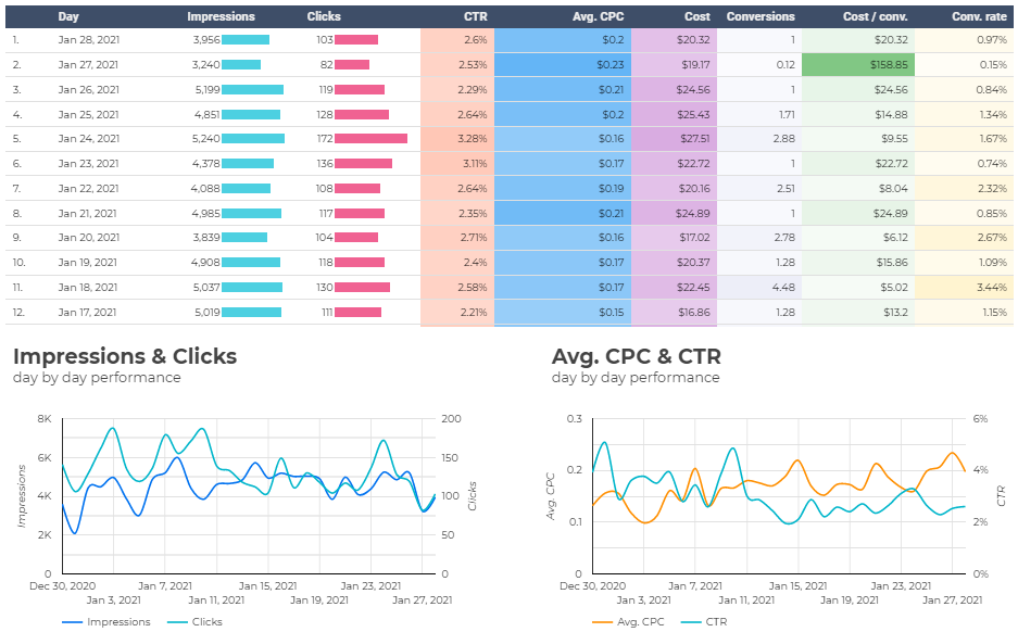
This table shows how Impressions, Clicks, CTR, CPC, and other metrics change day by day.
Take a look at the charts below the table to discover dependencies and gaps between Impressions and Clicks, as well as CPC and CTR. For example, if the Average CPC grows while CTR is decreasing, the reason for that may be in a low Quality Score.
#4: Day by day stats (Conversions)
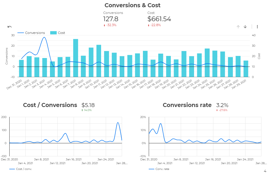
This page shows the overall Conversions and Costs for the selected period as well as day by day stats on the charts.
The Conversions & Cost chart lets you understand how your Cost influences the Conversions. For example, if you increase the Cost while Conversions become lower, the problem may be in broken links or poor landing pages usability.
#5: Day by day stats (Trends)
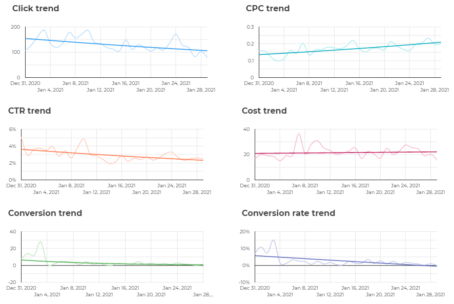
When you’re exploring the charts, it may be challenging to understand the overall trends. That is why we created the whole page with trend lines for key metrics.
#6: Compare to the previous period
On page #6, you can see how Conversions, Cost, and Conversion Cost changes compared to the previous period.
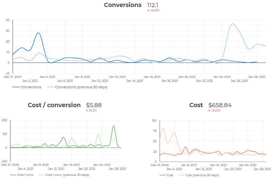
The period duration for comparing is equal to the number of days in the reporting date range. For example, if you select the data range Dec 11, 2020 – Jan 28, 2021 (49 days), the metric values will be compared to those for the previous 49 days.
#7: Campaigns
On this page, you can see your campaigns’ performance. The table shows the key metrics for each campaign. The higher values are marked in more intense color.
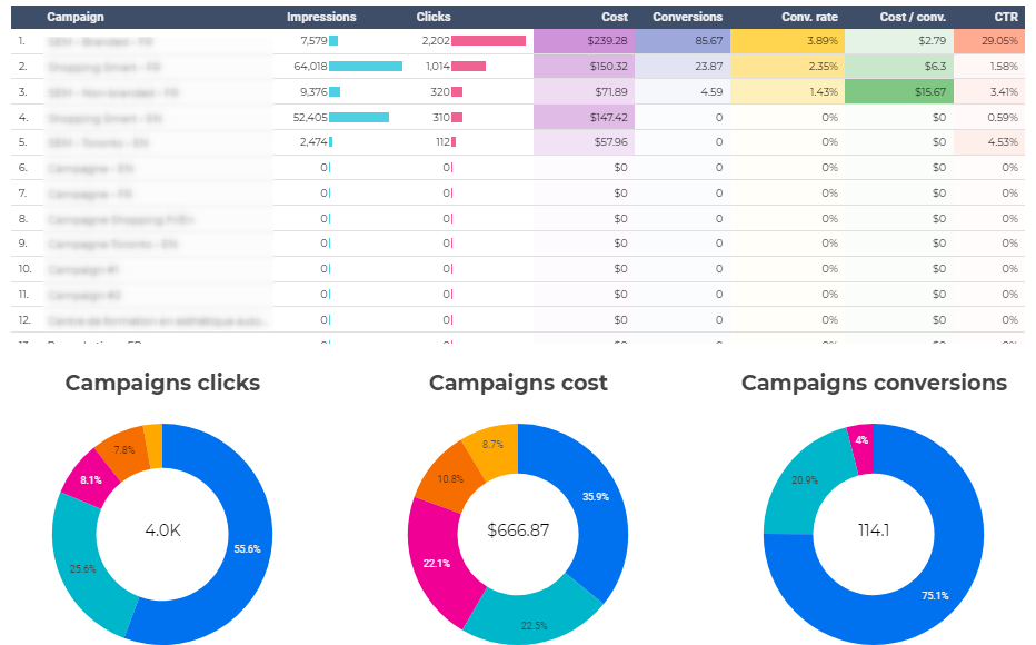
Below the table, three pie charts show the share of campaigns in the overall Clicks, Costs, and Conversions. To see the campaign name, hover the cursor over the chosen chart sector.
#8: Devices
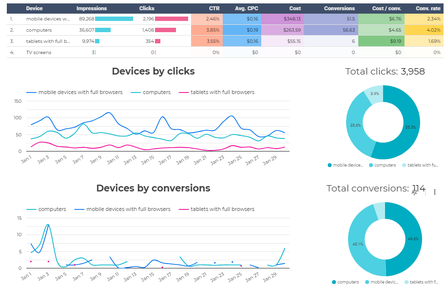
This report gives you an opportunity to analyze data across devices: Mobile devices, PCs, Tablets, and TV Screens. The table shows the key metrics for each device.
Analyzing graphs, you can compare Clicks and Conversions change across all device types. Using this data, you can effectively provide device bid adjustments.
#9: Gender & Age
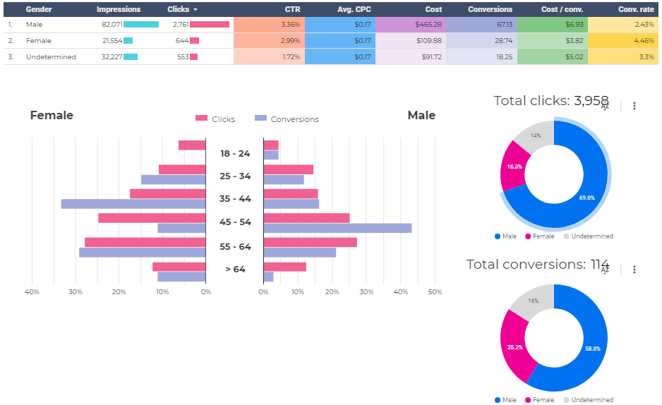
With this report, you can understand the performance of different gender and age groups of your audience. This data will be helpful while adjusting bids by audiences.
#10: Network
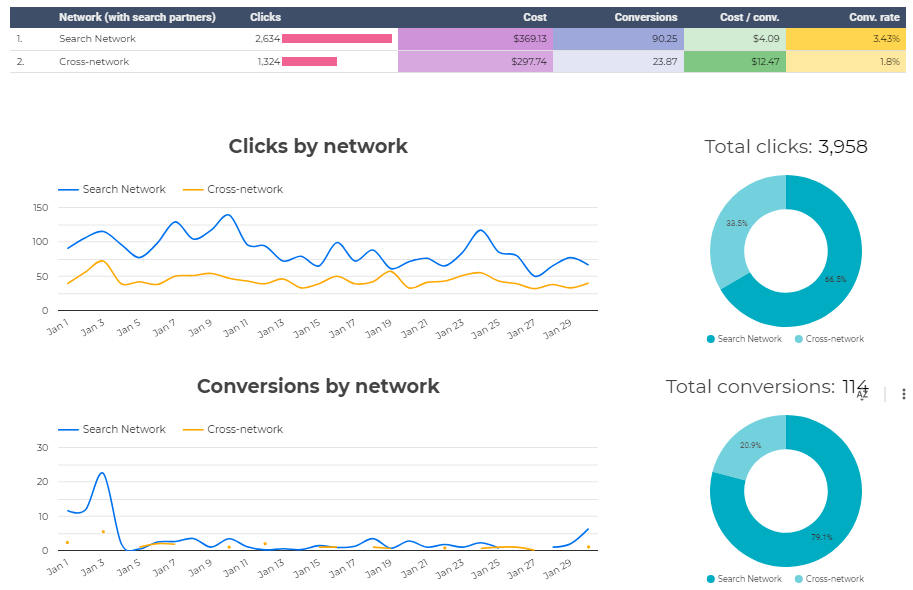
Analyzing data across networks, you can uncover the most performing ones. For example, if the Search network is much more performant than the Display one, you can disable GDS in your Search campaigns or reallocate the budget in favor of Search campaigns instead of Display ones.
#11: Geo
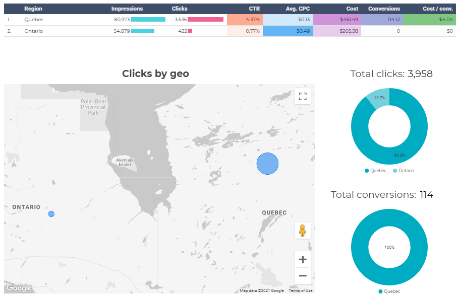
On the Geo page, you can see the key metrics for targeted locations. They are shown in the table. The interactive map shows how many clicks one or another region drives. This data will come in handy for you while setting up location bid adjustments.
#12: Search term
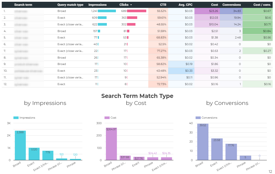
Search term report aggregates performance data for each search term that triggered clicks and impressions. Besides performance metrics, you can see the match type for each query.
To discover what match type is the most effective, look through the charts below the table—they show data by Clicks, Cost, and Conversions. For example, if Broad match queries drive most traffic but result in low conversions, it makes sense to shift to Phrase or Exact match.
#13: Keywords performance
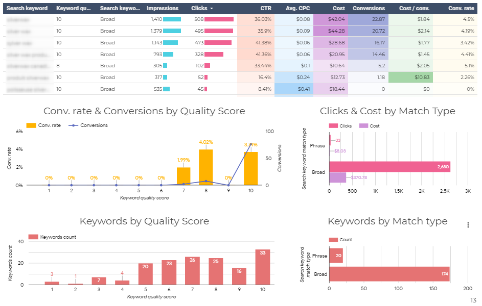
This report is essential for uncovering the best-performing keywords, as well as less-performing ones. In the table, besides the performance metrics and match type, you can see the Quality Score for each keyword.
On the chart below, you can track dependence between Quality Score, Conversions, and Conversion Rate; these insights will be helpful to understand how Quality Score impacts your performance change.
Also, there is a chart with keyword distribution by Quality Score; it helps you understand the approximate scales of work that need to be done to improve your keywords’ quality.
#14: Days & Hours
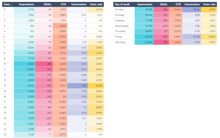
In most cases, PPC performance varies throughout the day and week; some hours and days of the week are more converting than others. The Days & Hours report provides you with heat maps that show how key PPC metrics vary depending on the days and times; this data helps schedule bid adjustments.
#15: Competitors
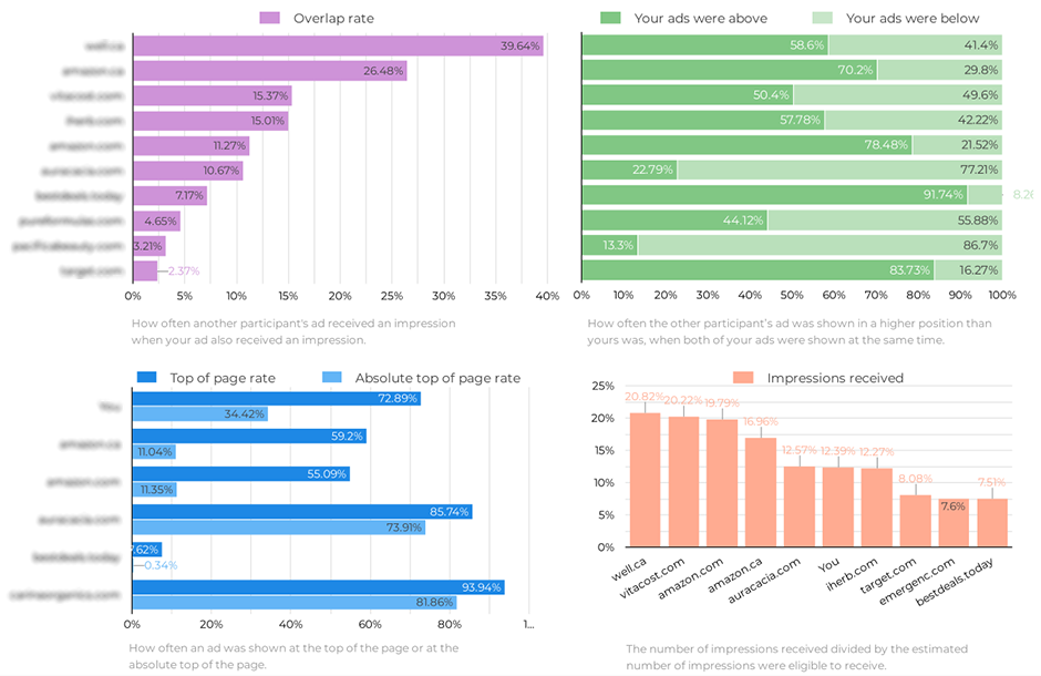
This report displays Auction Insights. It shows how your ads are performing compared to other auction participants and helps define your PPC strategy to overtake your competitors.
Here is what useful data you can find here:
- Overlap rate. It shows how often the other participant’s ad received an impression when your ad also received an impression. If the Overlap rate is low, you should analyze your competitors’ keywords to uncover missing ones. You can do it with our Competitor Analysis tool.
- The Above / Below rate. This rate indicates how often the other participant’s ad was shown in a higher position than yours was, when both of your ads were shown at the same time. These insights are beneficial for adjusting your bid strategy. For example, if your ads in the most searches stay below your competitors’ ads, you should increase your bids for getting better positions.
- Top of page rate / Absolute Top of page rate. These rates show how often your ads were shown at the top of the page or at the absolute top of the page. This data helps adjust the bid strategy to overtake your competitors in Paid Search results.
- Impressions received. This chart shows the number of impressions received divided by the estimated number of impressions were eligible to receive. This data helps you understand your audience reach compared to competitors.
#16: Work done
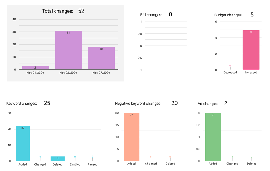
On this page, you can see how many changes have been performed to your campaigns during the reporting period. This data helps you monitor your team’s actions and report to your clients on the work that has been done.
6. How to Share the Report
You can share the report in three ways:
- Invite people. In the upper right corner, click “Share” or choose “Invite people” from a drop-down. In the pop-up window, enter Gmail addresses to which you want open access.

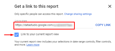
- Get report link. From a drop-down, you should select “Get report link.” You will get the link to your current report view. If you want to get a link to the default report view, you should uncheck the box.
- Download report. Choose this option if you want to download the report as a PDF.
